LUIZAJAN
BY EVITA LUIZA
ART6136
Practice & Professional Presentation: A Journey through the Process
INTRO
This module has started based on my known and established interest in female body and especially its perception in the Classical art period. I have decided to dedicate my dissertation on writing about the change that female body in art has gone through, from the times of Renaissance to modern art. This has provided me with an understanding of how my practical development should look like and be perceived. As a woman living in a contemporary world myself, I thought it would be relevant to play with juxtaposing past and present in one oeuvre, portraying this in both visual and technical methods. With that being said, I have started looking at modern artists who, for instance, mix already existent classical art pieces with standing out contemporary attributes. Some of them use classical art as a foundation for their new insight installations or photography. Nevertheless, I found this experiment quite broad and important in terms of its analytical and socio-cultural aspects. I was always inspired by strong women from history and life as well as my own life experience that gives me power of making and generating new ideas.
ARTIST RESEARCH
Eisen Bernardo
An illustrator and graphic designer of Philippines origin. He is most recognisable for his work of cover art and classical painting mash-up series. Eisen acknowledged that magazine and album covers (like other contemporary artforms) were inspired directly (and/or indirectly) by classical paintings. The similarities and references can be observed. He really wanted to compare and contrast modern and classical aesthetics.
In 2009, the artist created his first “Mag+Art” for FHM Philippines as fan art. Fortunately, they featured his works in the “Incoming Art” section of their anniversary issue. In 2014, he was revisiting his art to get inspiration for a new online project. He then tried to do the Mag+Art concept again, this time, using international magazine covers. After posting them online, the work became viral.
Eisen has exposed to a lot of magazine and album covers. So most of the time, he identifies the covers first. He is also fond of classical paintings, and so familiar with lots of artworks. The artist does a mental matching of the album covers and the paintings. However, when he does actual implementation in Photoshop, it is like he is assembling a jigsaw puzzle. It’s trial and error. Sometimes, his instinct/mental matching is correct, Eisen says but when they don’t fit, he needs to do a lot of research online to look for a matching artwork. Most of the time, the pieces posted in his Instagram are just product of beautiful accidents. All of them are unplanned and he is always surprised with the output. The artist notices, that it tests his knowledge of the classical arts (visual, literature) and popular culture (music, showbiz/celebrities).
"I can say that I’m the first digital artist to combine cover arts (magazine, dvd, album) and classical paintings. It became viral because the idea of the collage is very simple. It is very easy (but finding the perfect match, visually and conceptually, is challenging. Anyone can do it, but no one thought of it." - Eisen Bernardo, 2017


Yinka Shonibare "The Swing" (after Fragonard), 2001
The Swing (after Fragonard) is an installation in which a life-size headless female mannequin, extravagantly attired in a dress in eighteenth-century style made of bright African print fabric, reclines on a swing suspended from a verdant branch attached to the gallery ceiling. Beneath her, a flowering vine cascades to the floor. The figure is static, poised at what appears to be the highest point of her swing’s forward trajectory. Her right knee is bent, while her left leg stretches out in front of her, causing her skirts to ride up. She appears to have just kicked off her left shoe, which hangs mid-air in front of the figure, suspended on invisible wire.
Yinka Shonibare’s The Swing (after Fragonard), made in Sheffield in 2001, is based on an iconic Rococo painting by Jean-Honoré Fragonard, The Swing (Les hazards heureux de l’escarpolette), 1767, which depicts an aristocratic young woman in a frothy pink dress sweeping through a garden on a swing. In her abandon, she has kicked off one tiny pink shoe; Fragonard catches the moment the shoe arcs through the air. The woman is watched by two men; one pushes her from behind a tree, while the other lies in the foliage beneath her, precisely and mischievously placed to look up her billowing skirts.
Shonibare’s work paraphrases this scene, replicating part of the composition in three dimensions. He has preserved the woman on the swing, her shoe in mid-flight, and some of the foliage that surrounds her, but excluded the two men and much of the garden. The woman is dressed in African print fabric, representing a different kind of decorative opulence from Fragonard’s silk and lace. This creates a disjunction; the sculpture is both familiar and strange.
The artist’s intention is that the piece should be viewed straight on, with the figure seen from the same angle Fragonard depicted it in the painting. However, because the installation is rendered in three dimensions, viewers can walk around the swinging woman in the gallery space, placing themselves in the position of either of the men in the painting. The audience becomes directly implicated in the erotic voyeurism of Fragonard’s image, and, like the reclining man in the painting, can also look up the woman’s skirt. The mannequin wears knickers made of the same fabric as her underskirt.
The sensuality of the original painting is maintained and critiqued in Shonibare’s version. The opulence of her dress and the frivolity of her gesture, swinging languidly across the gallery, make Shonibare’s figure a direct translation of the Fragonard original. However, Shonibare’s coquette has no head, which may allude to the literal fate that awaited the aristocracy after the French Revolution; only twenty-five years after Fragonard painted The Swing, the guillotine was introduced in Paris to more efficiently execute royalist sympathisers.
The mannequin’s skin is dark, and her dress and shoes are made out of brightly coloured African print Dutch wax printed cotton. Dutch wax textiles have been a signature in Shonibare’s work for many years, and represent the cultural hybridity central to his practice. The fabrics have a complex history. Indonesian batik techniques were appropriated and industrialised by the Dutch during the colonial period. English manufacturers copied the Dutch model, making fabrics in the Dutch wax style in Manchester, using a predominantly Asian work force to produce designs derived from traditional African textiles. The fabrics were then exported to West Africa, and became popular during the African independence movement, when their bright colours and geometric patterns became associated with the struggle for political and cultural independence. Today they continue to be sold in Africa and in markets in New York and London. Their designs are constantly adapted: one of the layers of fabric in the skirt in this work has a Chanel logo motif.


Shonibare was born in London and grew up in the UK and Nigeria. He describes himself as ‘a postcolonial hybrid’ (quoted in Perrella, ‘Be-Muse. Between Mimesis and Alterity’, in Yinka Shonibare: Be-muse, p.16) and the fabrics he uses are a symbol of this multi-cultural identity. By dressing one of art history’s most famous French coquettes in African print, Shonibare reminds us that identity is a construction. The magpie-like creation of identity from various historical and cultural signifiers is a key theme in Shonibare’s work. Perhaps his best-known work, Diary of a Victorian Dandy, 1998, commissioned by InIVA and reproduced on posters on the London Underground that year, is a series of photographs of the artist cavorting his way through a hedonistic day in Victorian London. The photographs portray the artist as a glamorous outsider figure with the refined sensibilities and sartorial elegance of the Wildean dandy. In a subversion of the Victorian notion of the black savage, the images glamourise black identity in a fin-de-siècle context. Shonibare suggests that the attitude of the dandy is available to be adopted and discarded like a well-made suit. Similarly, The Swing (after Fragonard) suggests that the idea of a pure or authentic identity based on traditional notions of nationality, race or class is as anachronistic as a corset and bustle.
Marina Danilova
A glamorous dress can act as an unconventional canvas for a gorgeous work of art. This idea is beautifully highlighted in Paint Me Over, a photography series by Marina Danilova that features a model donning extravagant gowns painted with stunning depictions of landscapes and architecture. Long voluminous skirts and form-fitting bodices act as vessels for large, textured brushstrokes whose fluidity conveys glittering flecks of sunlight and vibrating, reflective scenes. As the model shifts her poses, the paintings always look different—some areas are obscured while others revealed—and they offer alternative interpretations of a single composition.
Designer Svetlana Lyalina is the woman behind the fashions seen in Paint Me Over. She is best known for her couture wedding dresses, but she created this special line in collaboration with paintings by Nikas Safronov. Originally worn for a recent 60th birthday of Safronov, they’ve since been immortalized in the exquisite Paint Me Over images, which happen to be shot in his stunning home, among gilded furniture and regal drapery.


INITIAL DEVELOPMENT
The first photoshoot I ran was totally sudden in terms of sense and meaning, although I have initially had and idea of how exactly that one shot should look like. I wanted to use syringes around my models' head to symbolise a nimbus. Nimbus is an attribute commonly portrayed around heads of the saints to represent their cleanliness and bright intentions. Here, on contrary, I am using a negative object that intentionally symbolises the nimbus light, thus it has another, contradicting meaning. Valeria has an armour in her hands that she holds as it was a baby to represent war, control and dominion. Both of these attributes are speaking for common issues of the modern world. War has always existed and its presence today has not decreased. But drugs, in the modern, global world - are certainly functioning as weapons of genetic destruction (as well as tobacco and alcohol). The control over sales and production is carried out by public organisations, which we call "government", and it also collects the "bribe". This is a way to specifically inflate the hotbeds of tension to create a field of instability, which subsequently allows the worst types of activities to flourish. This brings two benefits: removes the cancurier and brings a huge income. This is a built system that keeps people unaware (fake news), controlled and part of the crowd. I see that as a serious problem of our world today. This picture is more than drugs and war, its about being fooled by the system.
The model is wearing blue cloth and situated on the tiled floor. Deeply rooted in Catholic symbolism, the blue of Mary's cloak has been interpreted to represent the Virgin's purity, symbolise the skies, and label her as an empress. For blue was associated with Byzantine royalty.
I also thought of the reference to religion, which is also a weapon of the control used by the authorities. Some people may say that overall, with all that cloth composition, she may have an impression of a muslim lady.
In making of that photograph I did not have any thought on continuing of producing similar portraits and it was absolutely influential.


TURNING IT INTO SERIES, TWO MORE SHOOTS
After a way full of hesitation, I have made a decision to make more of such portraits and eventually turn it into series. I have had two more staged studio photoshoots to help me develop a further understanding of what my final outcome should look like. I would call these photographs drafts or sketches to prepare for the 'clean' version. They deserve to exist in the framework of individual photographs, although not as part of the serial project that I came up with later. Initially,I was just trying to comprehend ways of combining classical female figures with modern equipment, clothes and attributes. I am quite indecisive and bipolar in life so I assume this has an impact on art that I have been doing so far - its contradicting and always been a mixture of two opposites.
The following photoshoot was to tell the audience about how dramatically we have surrounded ourselves with gadgets. The model is holding her laptop as if it was the tables of Moses, simultaneously having her ears plugged with AirPods. And what could be more mainstream in terms of technologies today than Apple? Interestingly, I have also used Apple products for the sake of referencing it to Eve's apple, too. The background and colour colour correction are warm, as if she was enlightened with a natural, candle light.She is sat in the movement pose, inviting to follow and join her on the right path. I have also used a very cheap fabric and sand colour cloth to highlight that difference between ascetic lifestyle and being surrounded by technological goods. It is all about contradiction.

Continuing the topic of spoiled and hypocritical days of modern society. Here, the center of the contradictory composition is the fact that a saint person is holding an icon in her hand, showcased from a digital device. With that being said, so many ecclesiastics today are hypocrites in their lifestyle. Religion and church has become a way of earning money and fooling people, remaining them in control. I see that using an iPhone for praying or to depict icons from it as controversial to the initial religious promise. Model's facial expression is dull and indifferent, this is putting the viewer in doubt of how pure this woman's intentions are. her gesture, mimics and posing is almost saying "I am lying and I possess no care for any religious doing"


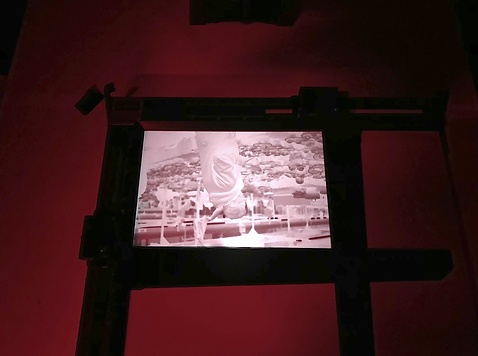
WORK EXHIBITED AT NIGHT SCHOOL & CHRISTMAS LEVEL 6 SHOW (TESTING WITH AUDIENCE)


EXPERIMENT
At this stage I still did not have a clear understand of what exact message my work should transmit to the audience, as it was always crucial to me that my art is interactive with the viewer. I have continued on taking portraits of Renaissance style women, and tried to remake a well-known painting by Vermeer called "The Girl with a Pearl Earring". This has turned out successful in terms of an independent piece, but unfortunately it looked out of place compared to the three other goddesses that I had. First, this has turned out as a quotation of an existent painting. Second, she does not proclaim any message or issue and does not represent any type of religious content. Furthermore, the final outcome has turned out in a fashion industry manner, that rather be placed in a vogue magazine other that next to other photographs I took.

WHAT'S NEXT?
(FILM) PHOTOGRAPHERS RESEARCH
To support my module progression and develop new skills along the way. I have decided to acquire new techniques. Film photography has always been an essential method to me, with its old school vibe and feeling of nostalgia, richness and tenderness of colour. It is always crucial to get to know the process of making from the inside. Living in the 21st century we do not have to put any effort into photography printing, it is being developed by the machines. Though, acquiring the technique both theoretically and practically, we make it more than just a dull photograph, we give it a life and it becomes an artwork itself. It is always more interesting to touch and look at something when it has a history - a history of making for example. I reckon that if you are positioning yourself as a photographer you have to start from the basics, and even if you are not using the initial photography techniques, you have to be aware and be able to navigate for the sake of intelligence and development of the subject of your doing. I have gained relevant knowledge while working with film, and I consider the outcome and this blog (where I describe the whole process) as part of my Practice and Professional Presentation final outcome.
Mira Heo
Film photographed based in Seoul, South Korea. Stating that her main inspiration is cinematography, she pretends to be a film director whilst taking her images, creating a storyline the whole time. Most inspiring of all perhaps though, is that most of her work is self portraiture. Stating that photographing herself has proven the easiest way to convey the emotions she wants, you’ll rarely see anyone else in her 35mm film portfolio.
The young, but already well-known, Korean photographer Mira Heo has the extraordinary ability to portray people (and often herself) in locations that might look fortuitous and minimalist. At the same time she is able to make her pictures immediately recognisable, following a very personal and effective style.


Annie Leibovitz
An American photographer who rose to fame taking shots of The Rolling Stones (started work as a photographer on Rolling Stones magazine) and other pop figures of the 1960s including John Lennon and Yoko Ono. She is a noted portrait photographer, having photographed most important figures in the USA since that time.
Her practice includes commercial photography, social commentary and journalism. Her background was in journalism rather than fashion photography. For portraits, she attempts to get to know the subjects so she can make more insightful work.
In the mid 1970s Rolling Stone started using color photography so Leibovitz did the same. She had photographed John Lennon several times for the magazine in both black and white and color, but her most well known image of the musician was taken with his wife, conceptual artist, Yoko Ono. Untitled (Yoko Ono; John Lennon) depicts the couple in an intimate embrace with a naked Lennon curled around a fully clothed Ono, lovingly kissing her cheek. Leibovitz had originally hoped to just photograph Lennon, but he insisted Ono be included. Hoping to reflect the sentiment of their Double Fantasy album cover, which showed the lovers kissing, Leibovitz requested they pose nude together. Ono refused to remove her clothes but Lennon disrobed. Leibovitz has always encouraged her subjects to have input, and in this instance the clash between clothed woman and naked man subverts the conventional art historical canon which so often fetishizes the nude female form. Ono's refusal to disrobe juxtaposes her husband's display of affection and vulnerability.
The image was taken only a few hours before Lennon was shot and killed outside his Upper West Side apartment by crazed fan, Mark David Chapman. It was first published on the cover of Rolling Stone and would quickly become iconic for its timing and the manner in which it immortalized the couple's devotion towards each other. Leibovitz understands that the photo's special status is a result of the musician's tragic death occurring immediately after the shoot. "It's actually an excellent example of how circumstances change a picture. Suddenly, that photograph has a story. You're looking at it and thinking it's their last kiss, or they're saying goodbye. You can make up all sorts of things about it. I think it's amazing when there's a lot of levels to a photograph." In 2005 the American Society of Magazine Editors voted the image the best magazine cover of the last 40 years.


Annie Leibovitz got to know many of the celebrities she photographed. Sometimes this led to lasting friendships. For example, Demi Moore invited Leibovitz to do her wedding photography, and agreed to have nude photographs taken when she was heavily pregnant. The one below was featured on the cover of Vanity Fair in 1991.
Leibovitz's staged portraiture earned a reputation as being intentionally provocative when actress Demi Moore was featured on the cover of Vanity Fair. Wearing only a 33-carat diamond ring and earrings, the seven months pregnant star stands in profile against a gray backdrop. One hand covers her breasts while the other tenderly cups her pregnant belly; framing the obvious focal point of the portrait. Looking over her shoulder and away from the camera, the star proudly displays her naked body.
In the 1990s when the Culture Wars were at their peak, the cover image was seen as an unprecedented provocation from a mainstream publication. When the issue was released, the controversy and backlash was immediate. A celebrity on a cover of a magazine, completely naked and visibly pregnant was considered grotesque and obscene. Many retailers refused to sell it or displayed it covered like a pornographic magazine. The photograph started a nation-wide discussion on femininity, propriety, and what it meant to be a good mother. Critics deeming Moore unfit for motherhood for posing nude, while advocates celebrated her bold celebration of the natural state of pregnancy. George Lois, the long time art director of Esquire magazine contests, wrote that the image was a "dramatic symbol of female empowerment...that conveyed a potent message that challenged a repressed society." As a result of its controversy, the portrait has become one of the most iconic images of the past two decades and was named by Time Magazine as one of the 100 most influential images of all time. In context, it stands as an example of Leibovitz's skill using popular celebrities to engage with larger sociocultural debates.
Annie Leibovitz is, perhaps, best known for her fashion and entertainment celebrity work, but her personal, landscape and documentary work is at least as strong. This makes up the bulk of the photographs in her book. Where celebrities are shown, it is often in the moments between the professional shoots.


Steve McCurry
Another famous film photographer, Steve McCurry earned his name by capturing the most remarkable portraits when he worked for National Geographic. McCurry’s career started in Afghanistan right before the Soviet aggression gained its strength. He managed to hide a few rolls of film from military customs in his things. His most famous work is “Afghan Girl” but there are many other beautiful pictures published in the New York Times and Time magazine.

"Afghan Girl" is one of the film portraits known all over the world. Somehow primitive but strikingly captivating, this portrait of a young girl has many admirers. Years later, McCurry tried to reproduce the portrait with the same girl but it has nothing similar to the original variant. Steve McCurry is still working as a film photographer. Most of his career he spent abroad taking remarkable film portraits of ordinary people.
Vivien Maier
shared the fate of many famous artists and gained popularity only after she died. Her way as a famous film photographer started in 2007 at an auction when John Maloof bought a case of negatives and undeveloped film. At that time no one knew that it was a real treasure. Vivian dedicated her life to kids and worked as a nanny. She shot at any occasion on the twin lens 6×6 camera that she carried everywhere. She captured everything that attracted her attention while she was walking around. Mostly, she photographed Chicago and New York. Vivian gained the title of one of the most prominent black and white film photography artists. People who knew her thought that she was aloof and weird, but her images express deep insight and the individual stories of strangers standing in front of her viewfinder. I can only imagine what people felt when they noticed an unfamiliar woman staring at them with camera in hands in the middle of Chicago, but her passion for creating a film photo resulted in accurate and excellent photographs. Another amazing thing about her pictures is the time travel effect. While they resemble 1940's or even 1930's, most of them are taken much closer to our days. Spend some time and examine her works in detail.
PRACTICE RESEARCH
(HOW IS THE FILM DEVELOPED)
CHAPTER 1: LOADING MY FILM
As a part of my project I have decided to acquire a new photography method from A to Z. I have had two special inductions on Camera Production and Darkroom Film Development. The camera that I first used was Pentax SLR 35mm, the process of inserting the film into the camera, shooting and ejecting the film roll afterwards is very fragile and small mistakes made might ruin the whole work.
First, I took the roll of the experimental film that I took, to develop Take the roll of film you want to develop out of your camera. It is important to rewind the film into the cassette using the handle on the side of the camera so that zero light touches its surface as the shutter gets opened.
The film is now brought into the darkroom and I set up my work area: since I am working in complete darkness, I had to set up beforehand so everything I need is right in front of me. To load and develop my film negatives I prepared:
-
A film reel. The reel is what you’ll load the film onto once you take it out of the cassette.
-
A film tank. A film tank is a sealable plastic container that you’ll develop the film negatives in.
-
A cassette opener. You’ll use the cassette opener to open the film so you can load it on the reel.
-
Scissors. You’ll need scissors to cut the film off the cassette.
The lights are now off and the film cassette is now ready to be opened. At this point, there should be no light in the darkroom. To open the cassette, I hooked the edge of the lid under the cassette opener. Then, bend the cassette to the side until the lid pops off.
I took the film out of the cassette and cut it off with scissors, unrolled the film until I reached the small plastic cassette in the centre. Then, cut through the film where it meets the piece of tape that attaches the film to the plastic. Everything is happening in a complete darkness, so I need to feel where the tape is with my fingers.


Loading the film onto the reel. To load the film, I start by holding the reel in one hand and the end of the film in the other, then I slide the film into it with a help of the slit on the edge of the reel. Once the end of the film is secure on the reel, I twist the side of the reel back and forth to wind the rest of the film onto it.
I then place the reel in the film tank. First, I have slided the tank’s detached core through the hole in the centre of the reel. Then I placed the reel flat in the bottom of the tank so the core is sticking up in the centre. The tank should be covered with the lid and tighten it into place by rotating it.

CHAPTER 2: ADDING DEVELOPER, STOP BATH AND FIXER

I used a thermometer to measure the temperature of the mixture. The temperature of the film developer and water mixture determines how long the film will need to develop for. Once the mixture's temperature is known, refer to the manufacturer’s instructions for the film to see how long it will need to develop. Every kind of film is different, so it’s important to read the directions.
Film typically needs 8.5 to 11 minutes to develop.


Turn the lights on and mix 1 part film developer with 1 part water. The film developer and water mixture is what I’ll use to develop my film negatives in the tank. I needed enough mixture to completely fill the tank. The exact amount to mix depends on the size of the film tank, but it’s usually around 470 ml of film developer and 470 ml of water.
Mixed the developer and water in a plastic container, not in the film tank. You don't have to stir the developer and water together.


Next, I pour the mixture into the film tank and set a timer. The uppermost plastic lid on the tank is pulled off to reveal the funnel-shaped hole underneath. It is important not to unscrew the larger lid that’s sealing the tank shut. I pour the developer and water mixture directly into the hole in the lid. Once all of the mixture is in the tank, I then cover the hole with the plastic lid and immediately set a timer for however long the film needs to develop (see the tables above).
I am agitating the film periodically as it develops. Agitating the film means turning the tank over continuously with your hands to help spread the developer around. Using the following schedule:
-
First minute of developing: Agitate the film for 30 seconds. Then, place the tank on a flat surface for 20 seconds. After 20 seconds, agitate the film for the remaining 10 seconds of the first minute.
-
Second minute of developing: Let the film tank rest on a flat surface for 50 seconds. Then, agitate the film for the last 10 seconds of the second minute.
-
Subsequent minutes of developing: Repeat the same agitation and rest times you used in the second minute of developing for every minute until the film is finished developing.
I am pouring the developer mixture out of the film tank. Taking the uppermost plastic lid off the tank so that I can empty out the mixture. Alternatively you can pour the mixture down a sink drain.

I filled the tank with stop bath and agitated it for 30 seconds. Stop bath is a liquid chemical mixture that stops film from developing any further. Once the tank is filled with stop bath, agitate it for 30 seconds to help the mixture spread throughout the tank.
Pour out the stop bath and fill the tank with fixer. Fixer is the last chemical used in the development process. It helps stabilise the film so it can be exposed to light without getting ruined. Once my film tank is filled with fixer, I seal it and follow the same agitation schedule I used for the developer mixture. The exact number of minutes I leave the fixer in the tank depends on the kind of film you’re using, but it’s typically between 3-5 minutes.


CHAPTER 3: RINSING AND DRYING MY FILM
Finally I empty out the fixer and rinse my film with cold water. Now that the film has been soaked in fixer, it’s safe to take the lid off the tank and pull the film reel out. I thoroughly rinsed the film with water for several minutes to remove any leftover chemicals.
The film needs to soak in the reel in a container filled with wetting agent for 30 seconds. Wetting agents help water roll off the film more easily when it’s drying. If you don’t use a wetting agent, your film could develop streak or bubble marks on it.


Last but not least, I take the film off the reel and unroll it. To take the film off the reel, I need to twist the sides of the reel in opposite directions and then pull them apart so the reel separates into 2 pieces. Then, slide the film off the reel and unroll it with fingers.
Hang the film up to dry. Use a clip to hang the film somewhere high up where it can dry, like on a clothesline or wire rack. Clip one end of the film to the surface it is going to be hung from, and attach another clip to the other end to weigh the film down so it is taut.
I let the film dry for 20 minutes only before I unclip it, because I am also using a dryer which speeds up the drying time (otherwise it takes a few hours.
IN THE DARKROOM


FINAL OUTCOMES
So here is the final result of the testing photography development. For training I have used film offered to us by staff in the process of learning. These were a good start to get to know how does the printing works: there are small details like branches and a palette of shadows. First, it was hard to fix the filters on the printers, set the contrast and highlights at the correct level, thus you can see that some of the pictures have unusual stains and shades. Interestingly, some of the pictures have a double reflection on both sides (see last photograph), this was caused as a result of using the prinitng paper for testing the lights. So, the paper that I subsequently used for picture transmission from printer, I have also used for testing (by applying its dull side). It caused a mild transmission through the dull side, and also printed on the glossy side as usual.
These experiments has introduced me into a new sphere of creation. I also consider this new skill crucial in the sphere of photography. Just like you learn opera basics in music, or classical basics for art making, I assume this is considered as ABC in photography.


Here we can see the result of my own pictures, shot and developed by me. I have lent Pentax SLR 35 mm from university equipment and went through Birmingham streets hunting for urban shots. I like this lively, everyday vibe of people minding their own business and being natural in their usual habitat: I tried to be as incognito as possible to catch a moment of life, not posture.


GLUTTONY, SLOTH, LUST & ENVY
'Gluttony' is certainly one of the deadly sins that I did not have to exclude from my "contemporary" list. My model is sat on front of the contrasting to her hair and cloth background, which makes it more interesting and inviting. I have noticed that looking in the camera lens at a viewer might seem daring, so I have asked my models to look somewhere away. Most of the photographs have their sights directed to the side and up high'this is thought to create a feeling of purity and sky as if they were portrayed on a classical paintings of the 15th-17th century. Fast food is certainly a 'sinful trend' of today, so to depict 'Gluttony' I chose McDonalds meal: it is proven, trusted, it is widely advertised, everybody likes it.
Followed by the 'Laziness/Sloth' photoshoot, I tried to put the model in a relaxed pose where she can lean on on a male torso. She has a remote in her hand and her sight is directed a little bit above the middle of the line of sight - this is the height on which a TV is usually allocated. She seems bored and unaware, I find the expression of her face as a key attribute to the composition. Eyes are tired, a little bit rolled and her lips are pursed as if she has no little interest in watching any of the channels nor doing anything else. Her cloth was changed in colour to dark blue: as described above, rooted in Catholic symbolism, blue colour has been interpreted to represent the purity, symbolise the skies, and labels an empress.
Planning the 'Lust' staging and composition, I already knew that I need this particular model to take part in my project as I thought her appearance, tanned skin (which is considered as an important part of being beautiful today) and sweet inviting face. She has a seductive look, flirting vision and her mouth is sexually open in eating a lollipop. The model is sat in half turn from the person she is looking at, which makes her more exciting and hidden. Jade is wearing a lacy bralette, gold hoops and red lipstick which I assumed to be a starter pack for an available woman, craving for men's attention. She opens up her clothes in a revealing movement to demonstrate her breasts. I chose warm, pink, muted lighting to give this composition a desired intimacy.


RE-SHOOTING
Because I was getting to the concept of 7 sins gradually, not having an initial clue of what impression the final look should create, I have decided to re-shoot some of the pictures. The issue with 'Pride/Hypocrisy' was simply the quality of the image. I shot it on my iPhone, so the quality has lost along the way of editing and I also could not afford to print it in A1-size. This photograph was restaged and now shot on Canon 800D in a RAW regime, thus composed similarly. I reckon it now looks more familiar with other photographs.
Talking about 'Greed', in turn, it was primordially shot to tell the audience about how dramatically we have surrounded ourselves with gadgets. Back then I was aiming to proclaim how different the past and present are, by mixing it in one picture. Holy Madonna holding her MacBook as if it was tablets of Moses, also listening to music through AirPods - how contradictory is that? Although after the intention of creating the 7 sins rose up, the meaning and staging of this picture has lost its message (within the framework of this project). The primary photograph could make sense, as if the mode was grabbing all that technology and it was never enough, but the facial expression did not persuade me to think that there is greed. Moreover, the model's head was too high from the centre which has differed it from other sinner sisters. I found that as looking less professional and successful, so I had to rethink it. 'Greed' is now portrayed with a stack of euros held close to herself. The money is held in a form of a fan, she is almost hiding behind it in fear that someone will encroach on her belongings.


RETOUCH, PHOTOSHOP AND EDIT
The editorial process was a necessary attribute to my chosen pieces. To make my models look as contemporary and sheer as possible. I chose the most up-to-date sources to achieve that. I tried to highlight some parts of their skin to bring it forward, or on contrary, darken some areas to hide them and make the body look skinnier. Why? Today's beauty trend mainly exists within the frames of healthy looking glowing skin with a perfect finish and a skinny sporty body. This combo is considered the most sexy and photogenic according to the last socially accepted beauty trends and norms. I have also paid attention into boosting the colour of the images to make it look richer in tones and more poster-like. I have noticed that people who actively post pictures online are separated into two groups: the ones who are up for natural shapes, body positivity and more of an ascetic style, whereas the second type are those who use a sharp photoshop on their pictures, many filters and apps for correction before posting anything. Of course, the second-type pictures typically gain more attention, when majority of the mass are just drawn by the accessibility of the content and driven by the accepted by society beauty norms (many people won't have their own opinion on beauty, they are majorly led by the so-called beauty trends of today. Photoshop is one of those trends (obviously, it is used secretly to portray one's 'natural unedited beauty', and to showoff how wonderful your life is... on Instagram of course). To bring this issue forward and to make it a joke I am using a lot of Photoshop on my models, which is making them look a little surreal and unreachably perfect. First, I am choosing the most successful picture and edit it using Adobe Photoshop CC 2019. I am then additionally using retouch and extra editing on VSCO or Photoshop Fix.


PLANNING ON INSTALLING THE WORK
Every photograph was printed on a glossy pearl paper in size A1 including white borders around each. This is meant to reconnect with Instagram framed pictures that have wider borders at the bottom of the photograph. Instagram today is one of the most popular portals to share imagery, so I thought this framing would be relevant to contemporary culture.
I am choosing to install my work in a particular sequence on a plain white flat wall, with a good lighting (preferably artificial). With that being said, my number one choice is F.01 studio. Artificial lights will create a feeling of an unnatural staged atmosphere, which may be a good addition to the manner of the style and excessive photoshop usage. The photographs should be placed in an order that present their colour and posing features in the most successful way.
Corner space is crucial for my presentation: three photographs to be placed on the left side and four of them on the right. Why? I am concerned that corner space creates a stronger communication between the characters. If, alternatively, the imagery was put on a straight wall it will provide a bigger distance between the models, and then they suddenly feel less connected to each other. Corner is truly one of the main features in the concept of my presentation. It creates a feeling of direct eye contact with all characters for the viewer too as one's standing in front of the work. The viewer is surrounded by photographs and is automatically taking part in this communication in-between.
For hanging I choose small silver bulldog clips that are convenient, easy in use and also create a feeling of weightlessness, as it leaves a space between artwork and wall. Bulldog clips help provide my goddesses with almost holy purity and sky elevation.
Covid-19. Regarding the latest concerns and university lockdown, I have though of another way to install my final work. We have to provide an online submission of he physical work that we have been working on. I believe that my final submission is going to be a folder of all 7 photographs separately, including the testing scheme that I have made to demonstrate how my work would have looked like in reality. Plus, I will include a link to this blog which explains my project from the start and has some of my experimental work along the way. I assume this is the best I can do in the given situation taking in mind that all of my photographs are also locked in the university.

I have tested the imagery in a smaller version to think of the most successful sequence and space outcome. Because I had to leave my work before I install it on the Final show myself, I have made all the necessary measurements and created a scheme of how I imagine my installed work. I believe the scheme that you can see here provides a better understanding of my concepts.


